Phoenixville Library
Timeline
3 week sprint
Role
UX Design (Team Project)
Team
Me, Xavier, Yeajin, Savannah
Tools
Figma
When my team and I were introduced to the Phoenixville Public Library, we had no idea this project would become one of the most rewarding challenges we’d tackle. The ask sounded simple: improve access to the library’s “Everything But the Books” program, a borrowing service for non-traditional items like cake pans, sewing machines, puzzles, and power tools. But what we uncovered was something deeper: a valuable community resource buried under confusing navigation, low visibility, and an outdated user experience.
As we explored the problem, we kept thinking: This is such a good idea, why does no one know it exists? That question became our starting point.
Phoenixville Library is a public library in Pennsylvania with a mission to serve and uplift the local community. Their non-book borrowing program was filled with possibility, but the experience of using it didn’t reflect that
Most users didn’t even know the program existed, and if they did, the experience was outdated, hard to navigate, and had no way to reserve items online.
This program had incredible potential, free access to helpful tools, fun items, and creative equipment but it was buried behind clunky design. The library team wanted something more approachable and intuitive that would actually get used by the community.
We designed a mobile app that lets users easily browse categories, view real-time availability, and reserve items for pickup, all with a clean, simple interface that brings the library’s offerings to life.
Our Approach:
From the beginning, this project felt like a puzzle. We weren’t just designing an app, we were designing visibility for something most users didn’t even know existed. So before we touched Figma, we focused on understanding what people actually needed from this experience.
Working in a small, collaborative team of four, we divided responsibilities naturally but stayed in close contact throughout. I focused heavily on the research side by leading user interviews, building out our affinity map, and defining our persona. But every decision was made together, and we pushed each other to stay grounded in the real-world user experience.
We didn’t want to reinvent the library, we just wanted to make it an easier and modern experience.
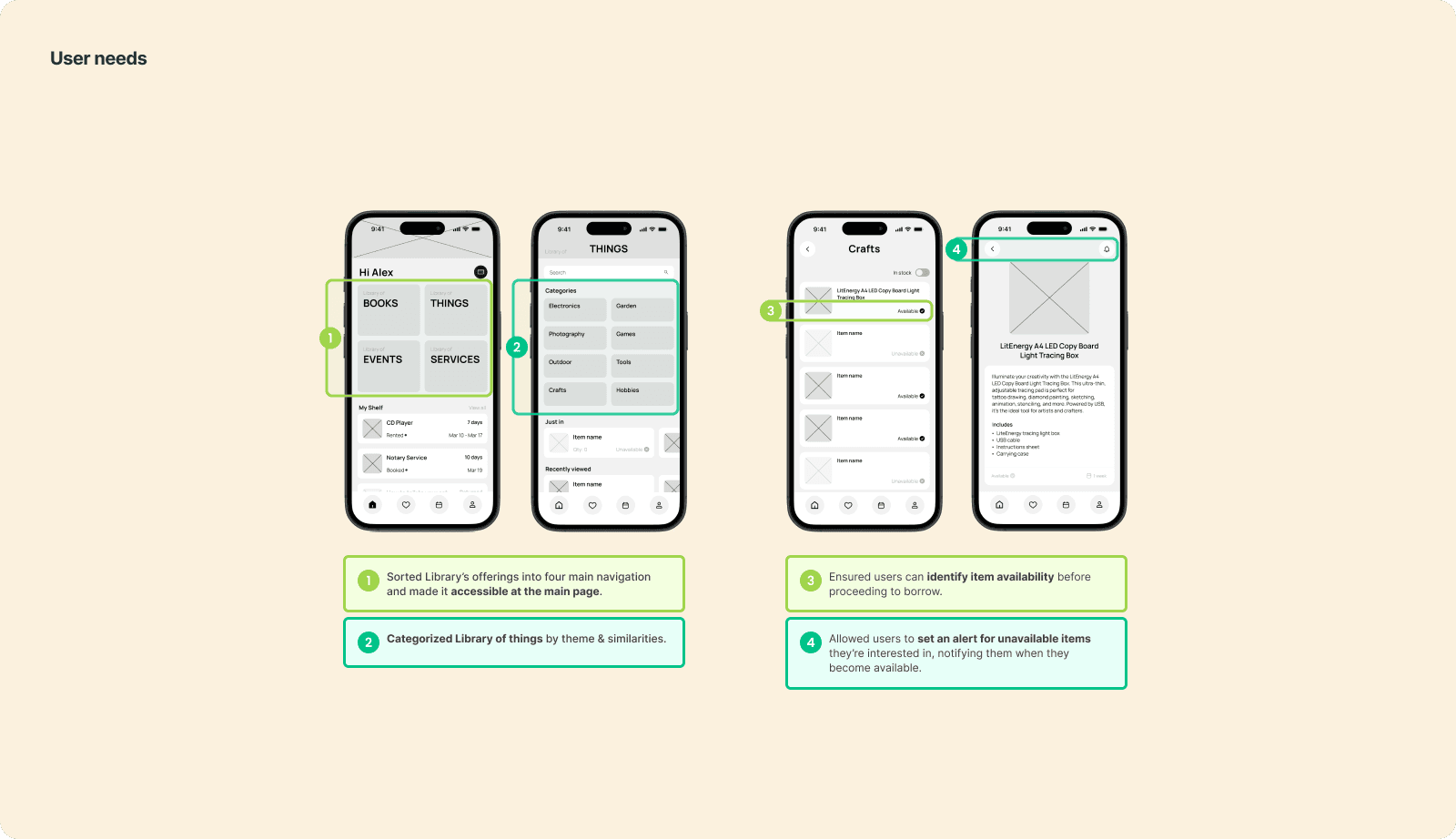
What was important to us
from the start?
Keep it simple: Users don’t need fancy—they need clear.
Respect the library’s tone: Friendly, not flashy.
Make borrowing feel accessible and welcoming for all ages and tech levels.
Stay scrappy: We had just two weeks to do it all.
Research:
We started by talking to real people who had used the Phoenixville Library along with weekly library goers. Our interviews focused on discovering how much users knew about the borrowing program, how they tried to access it, and what got in their way.
It didn’t take long to see the pattern.
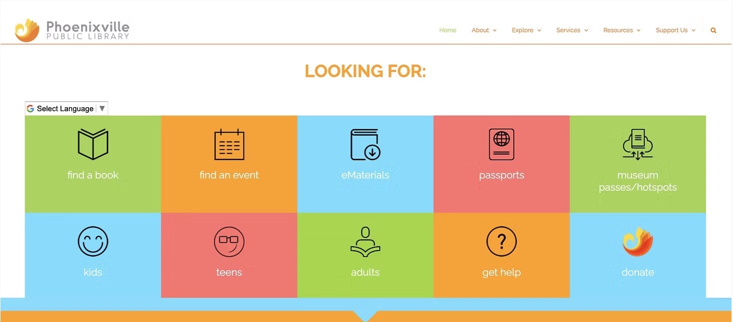
Some people had heard about the program through word-of-mouth, but most had never seen it mentioned on the website. Others knew it existed, but couldn’t figure out how to actually borrow something. For our online user interviews, we shared Phoenixville's current website.
Synthesis:
After gathering interview quotes and exploring user frustrations, we mapped everything out into an affinity diagram. This helped us group common themes, spot patterns, and get a clearer picture of what users really needed beyond what they were saying out loud
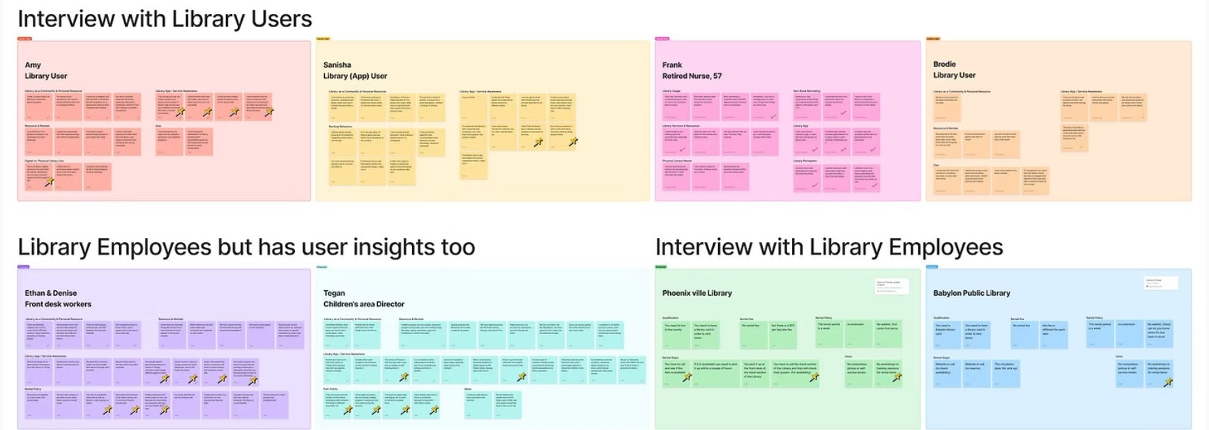

Some of the biggest themes were around visibility, trust, and ease of access. Users didn’t just want information... they wanted clarity. They didn’t just want a list... they wanted to see what’s available, when it’s available, and how to get it.
Research:
From our affinity map, we created our persona, Alex, a 32-year-old freelance designer and regular library visitor who represents our core user type. Followed by our problem statement.
Alex Rivera
Age: 37
Occupation: Freelance Designer
Background:
Alex loves the library as a vibrant community hub and visits often to work, attend events, and explore resources. However, navigating what’s available can be difficult, especially if she doesn’t know the exact name of a resource. Passionate about lifelong learning, she frequently checks out books on design and entrepreneurship but is most excited by non-book items like cameras, graphic tablets, and 3D printers. Poor website navigation and limited promotion often lead her to miss out on valuable resources.

Frustrations
Hard to Find Resources: Tough to explore without exact names or titles.
Confusing Navigation: Hard to browse and find resources
Low Visibility: Library services, events, and rental options aren’t well-promoted.
Messy Search: Lacks useful filters, making it hard to find the right resource.
Needs
Easier Discovery: Find and rent non-book resources faster.
Better Navigation: No need to know exact names.
Clear Availability: See real-time updates on item wait times and availability.
Community Connection: Meet like-minded people through events.
Goals
Effortless Discovery: Find and access library resources and events that align with her interests
Better Resource Promotion: Stay informed about new tools, events, and services.
Clear Navigation: Filters that make renting non-book items frictionless.
Seamless Experience: A system that works for her, not against her.
Problem Statement
“Alex, an active library user, faces challenges in easily discovering and accessing the library's resources beyond books. Because of poor website navigation, limited promotions, and unpredictable wait times, it makes it difficult for her to fully utilize the library’s offerings, hindering her ability to engage with the community and advance her learning..”
Journey Map:
After defining our user, Alex, and building a solution around her needs, we created a journey map to walk through her full experience using the new app. We wanted to make sure the flow we designed didn’t just look better, it needed to genuinely support users like Alex from start to finish.
This map let us step into her shoes and validate that every part of our design, browsing, booking, picking up, returning was doing what it was supposed to: making her life easier.
Ideation & Exploration:
Once we understood Alex’s needs and mapped out her ideal experience, we shifted into solution mode. This phase was all about exploration by throwing out ideas, comparing design patterns, and figuring out how to translate trust, clarity, and ease into actual features.
For competitive analysis, we looked at other library apps...
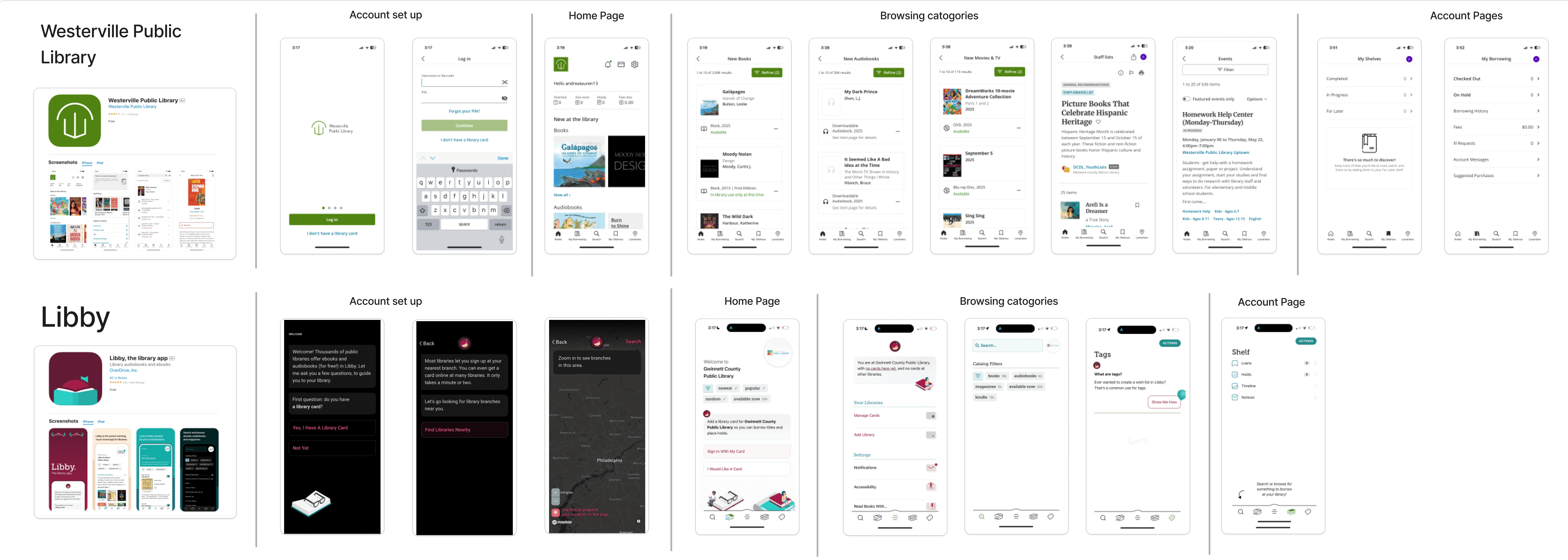
For competitive analysis, we looked at other library apps... For comparative, I looked at apps like Nuuly and ShopPickle to understand how modern borrowing / rental platforms organize their content. Both used clean layouts, visual cards, and smooth reservation flows, things we knew our app needed to incorporate. We weren’t copying—we were learning what worked.
Design:
With the structure in place and a clear sense of what our users needed, we began bringing the app to life—starting with a simple sitemap and task flow. These helped us align on the most important screens, what needed to be accessible up front, and how the reservation journey should feel from start to finish.
Our goal? Keep it clean. Keep it visual. Keep it usable.
We wanted users to open the app and intuitively know where to go without needing a tutorial.
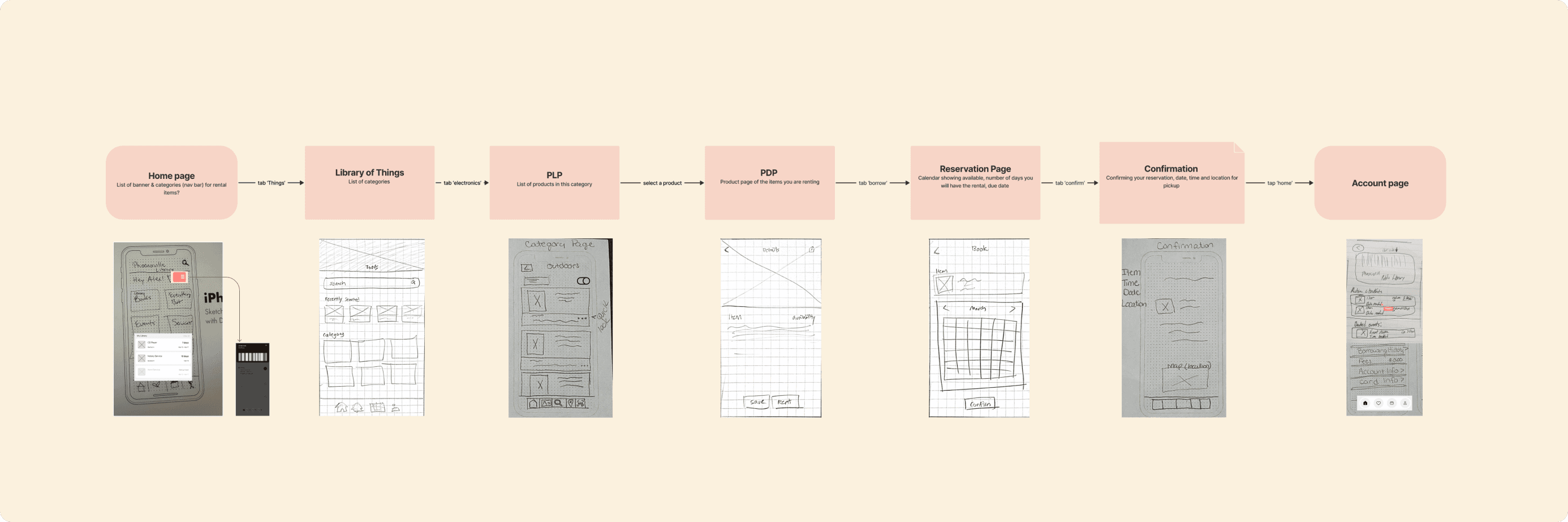
Sitemap:
Initial Wireframes:
Task Flow:
Testing & Iteration:
After we built our prototype, we ran usability tests with real users—including people who had used the Phoenixville Library before. We wanted to know: could they find items quickly? Did they trust the process? Would they actually use it?
The feedback was incredibly validating and incredibly helpful.
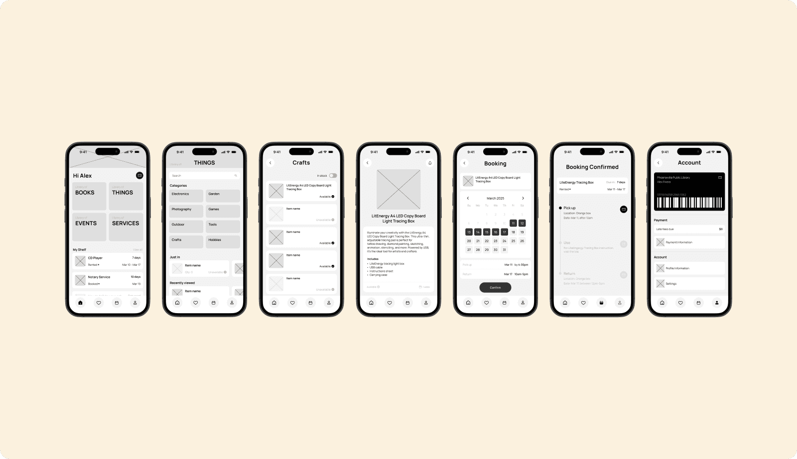
Final Wireframe:
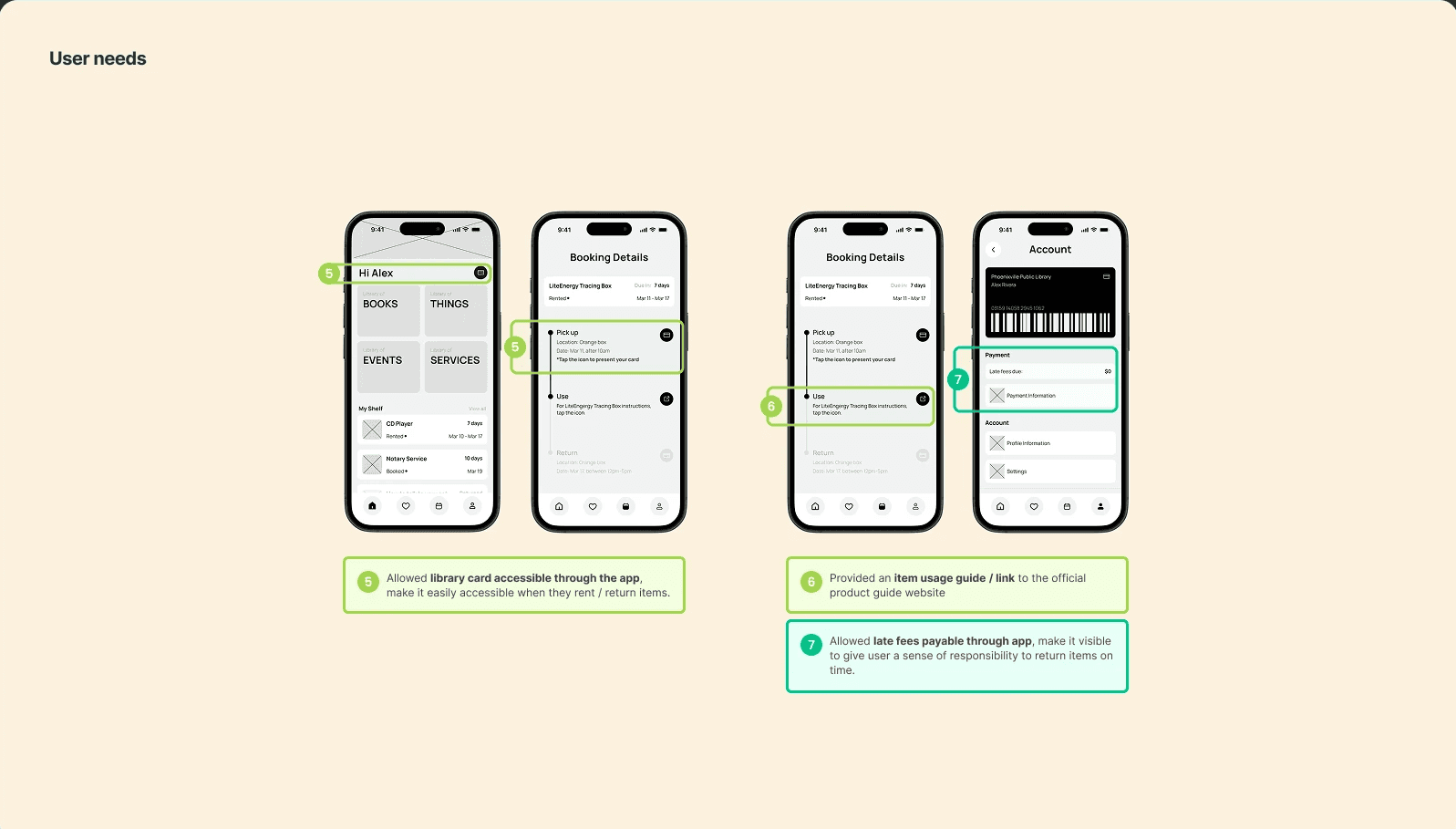
After gathering feedback and identifying what needed improvement, we took those insights straight into refinement. We made updates to availability indicators, repositioned key information, and streamlined the rental flow to make the experience feel even more intuitive.
Once those changes were in place, we finalized our high-fidelity wireframes and built out the working prototype.
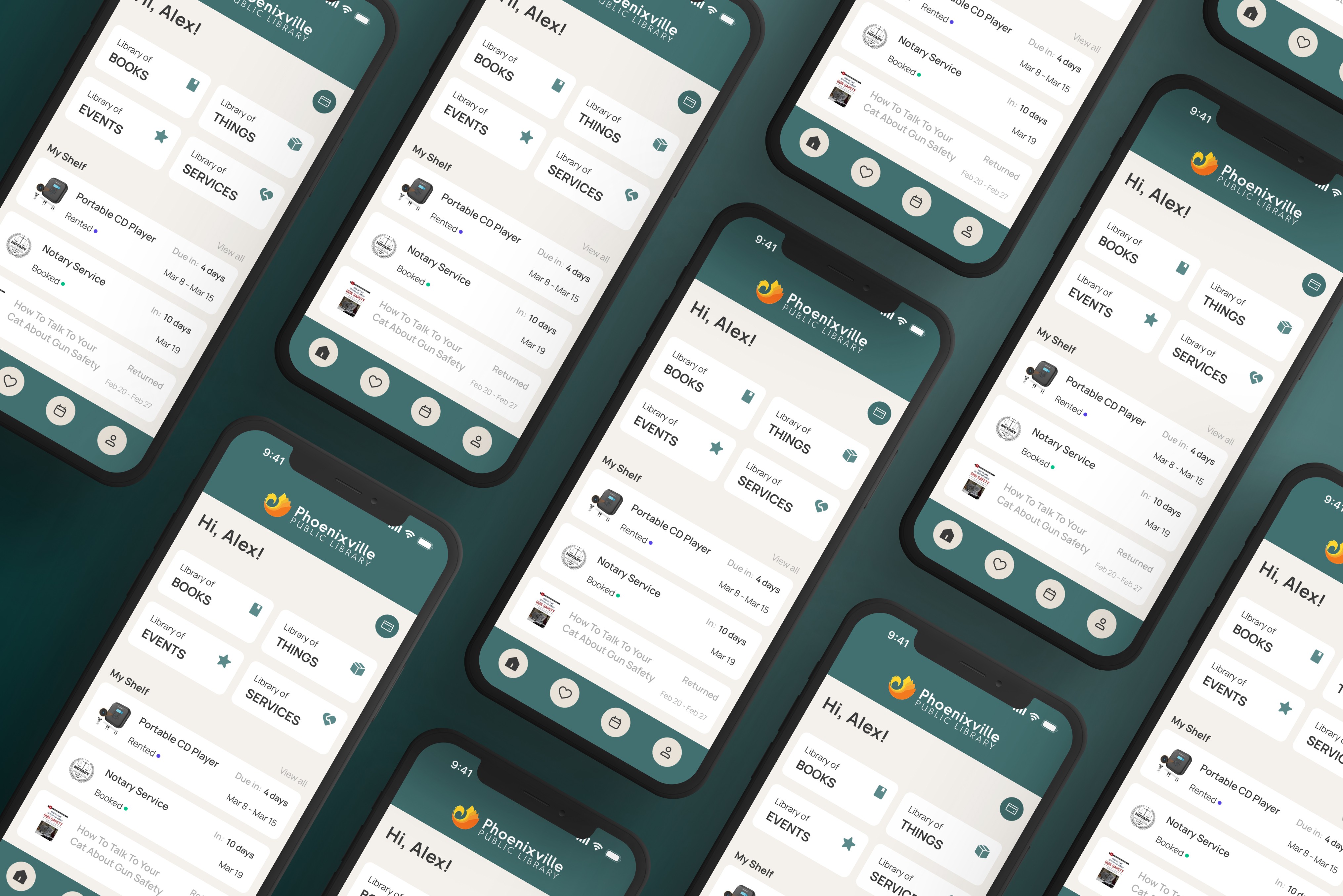
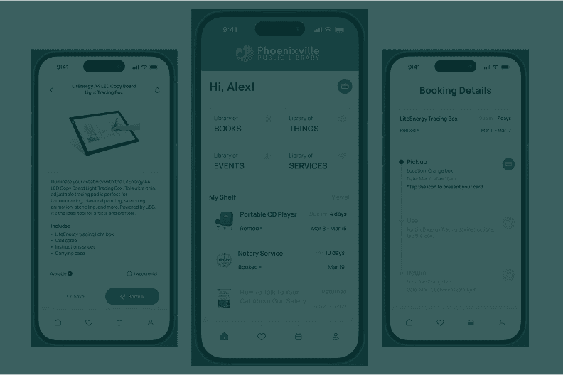
Prototype:
Outcome:
By the end of our two-week sprint, we had transformed a nearly invisible library feature into an intuitive, mobile-first experience that’s easy to navigate, visually engaging, and built around real user needs.
What started as a hidden community perk is now something users can actually find, understand, and use without the stress.
What we created wasn’t flashy, it was useful, and that’s what made it powerful.
It’s simple. It’s visual. It’s everything the old experience wasn’t.